How do I get a css grid column to only take width of the content?
-
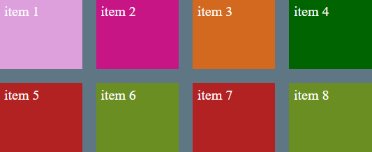
The demo code:
HTML
...
 <div class="container">
      <div class="item item1">item 1</div>
      <div class="item item2">item 2</div>
      <div class="item item3">item 3</div>
      <div class="item item4">item 4</div>
      <div class="item item5">item 5</div>
      <div class="item item6">item 6</div>
      <div class="item item5">item 7</div>
      <div class="item item6">item 8</div>
    </div>
...
CSS
...
.container {
        width: 800px;
        background-color: rgb(95, 118, 133);
        margin: 40px auto;
        display: grid;
        grid-template-columns: 1fr 1fr 1fr 1fr;
        grid-template-rows: 150px 150px;
        grid-gap: 30px;
      }

      .item {
        padding: 10px;
        font-size: 30px;
        color: #ffffff;
      }

      .item1 {
        background-color: plum;
      }

      .item2 {
        background-color: mediumvioletred;
      }

      .item3 {
        background-color: chocolate;
      }

      .item4 {
        background-color: darkgreen;
      }

      .item5 {
        background-color: firebrick;
      }

      .item6 {
        background-color: olivedrab;
      }

      .item7 {
        background-color: navy;
      }

      .item8 {
        background-color: yellow;
      }
...
The result is:
If we use the CSS value max-content for one of the columns instead of the fractional unit, we get the following results.
grid-template-columns: 1fr 1fr 1fr 1fr;in togrid-template-columns: max-content 1fr 1fr 1fr;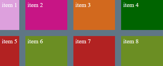
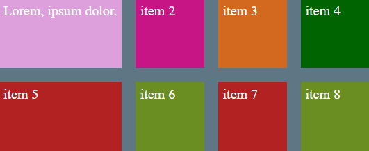
The content is not wrapped. For example adding more words to item1, we will see the following:
Changing
max-contentintomin-contentdoes wrap the content. The result is: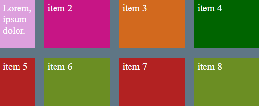
There is a another CSS value
minmaxcan also be used to control the width size of items, it take two values minimum width value and the maximim width value, as the browser window decreases size it will decrease up to the minimum value set and when the width of the browser windows is large enough it will take maximum width set.For example a value of
grid-template-columns: min-content 1fr 1fr minmax(150px, 300px);The forth column will keep its size down to a minimum of 150px as the browser shrinks, otherwise if the width is large enough will take up the entire 300px.
© Lightnetics 2024