How do I define css explicit and implicit grids?
-
This was covered in other articles. An explicit grid is where you define the CSS grid line numbers.
See the demo code below. Line numbers 7 & 8 in the CSS container define an explicit grid.
HTML
...
 <div class="container">
      <div class="item item1">item 1</div>
      <div class="item item2">item 2</div>
      <div class="item item3">item 3</div>
      <div class="item item4">item 4</div>
      <div class="item item5">item 5</div>
      <div class="item item6">item 6</div>
      <div class="item item6">item 7</div>
      <div class="item item6">item 8</div>
    </div>
...
CSS
...
.container {
        width: 600px;
        background-color: rgb(95, 118, 133);
        margin: 40px auto;
        display: grid;
        grid-template-columns: repeat(2, 1fr);
        grid-template-rows: repeat(2, 150px);
        grid-gap: 30px;
      }

      .item {
        padding: 30px;
        font-size: 30px;
        color: #ffffff;
      }

      .item1 {
        background-color: plum;
      }

      .item2 {
        background-color: mediumvioletred;
      }

      .item3 {
        background-color: chocolate;
      }

      .item4 {
        background-color: darkgreen;
      }

      .item5 {
        background-color: firebrick;
      }

      .item6 {
        background-color: olivedrab;
      }

      .item7 {
        background-color: navy;
      }

      .item8 {
        background-color: yellow;
      }
...
The result items 1 through 4 are the explicit grid You see the items 5 through 8 do not have size of 150px
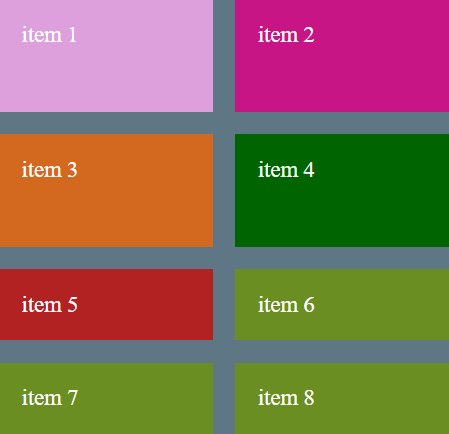
There are a number of CSS properties to control an implicit grid. The items 5 through 8
grid-auto-rowsdefines the height of the rows.If we define as
grid-auto-rows: 200px;in the CSS container. This results in the implicit grid items changing their size.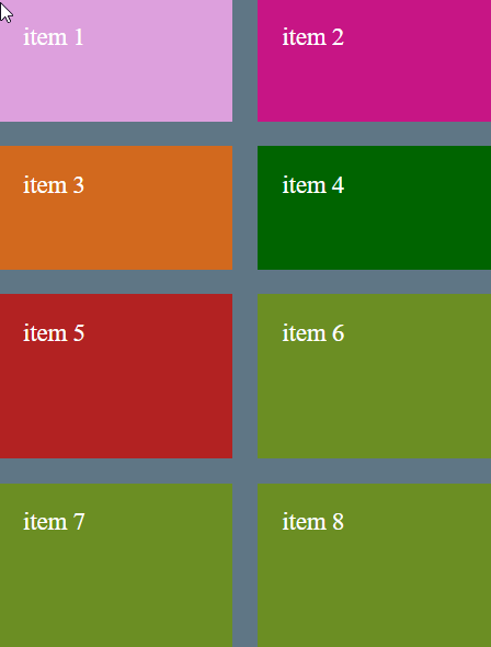
The implicit rows can be changed to implicit columns using the CSS property
grid-auto-flow: columnwhen using this because the flow changes to columns, the CSS property grid-auto-rows: 200px; would also has to changegrid-auto-columns: 200px;
© Lightnetics 2024