How do I use css grid areas to position grid items?
-
Also see:
How do I use css grid names instead of grid line numbers?
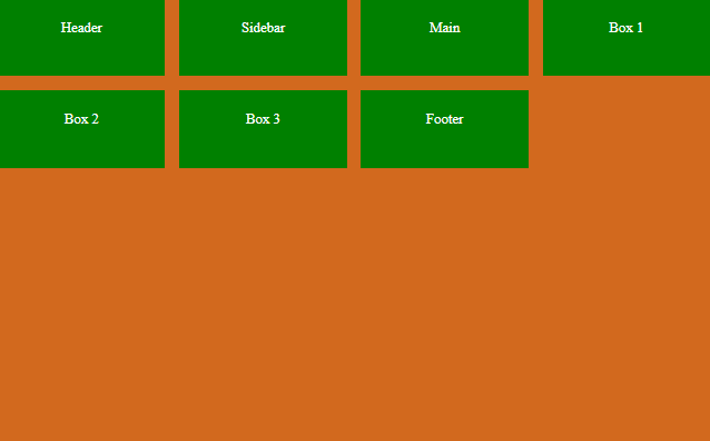
How do I position css grid items inside a container?Using CSS grid areas is another way of positioning grid items. Starting off with the following code.
HTML
...
 <div class="container">
      <div class="header"><header>Header</header></div>
      <div class="sidebar">Sidebar</div>
      <div class="main">Main</div>
      <div class="box1">Box 1</div>
      <div class="box2">Box 2</div>
      <div class="box3">Box 3</div>
      <div class="footer">Footer</div>
</div>
...
CSS
...
.container {
        width: 800px;
        height: 500px;
        background-color: chocolate;
        margin: auto;
        display: grid;
        grid-template-rows: repeat(5, 1fr);
        grid-template-columns: repeat(4, 1fr);
        grid-gap: 1rem;
      }

      .container div {
        background-color: green;
        font-size: 1rem;
        text-align: center;
        padding: 1.5rem;
        color: #fff;
      }

      .header {
      }

      .sidebar {
      }

      .main {
      }

      .box1 {
      }

      .box2 {
      }

      .box3 {
      }

      .footer {
      }
...
The result is:
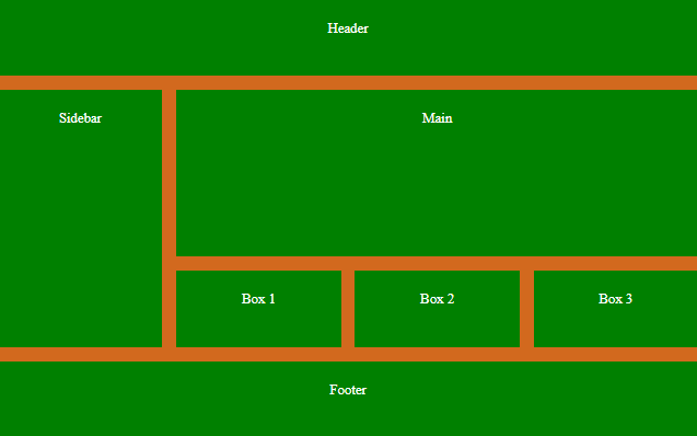
Let's position the grid items using grid areas.
Add a new CSS property
grid-template-areas... grid-template-areas: "header header header header" "sidebar main main main" "sidebar main main main" "sidebar box1 box2 box3" "footer footer footer footer"; ...The structure takes the layout of your web page in columns and rows. After this is done we just need to add the grid area names to our CSS sections.
...
.header {
        grid-area: header;
      }

      .sidebar {
        grid-area: sidebar;
      }

      .main {
        grid-area: main;
      }

      .box1 {
        grid-area: box1;
      }

      .box2 {
        grid-area: box2;
      }

      .box3 {
        grid-area: box3;
      }

      .footer {
        grid-area: footer;
      }
...
The result is:
© Lightnetics 2024