How do I use percentage measurements in css grid?
-
In article How do I make css grid items take up the entire container width? we saw the use of fractional units shown below:
...
grid-template-columns:  2fr 1fr 1fr;
...
Gives us:
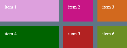
The demo code is as follows:
CSS.
...
.container {
        width: 800px;
        background-color: rgb(95, 118, 133);
        margin: 40px auto;
        display: grid;
        grid-template-rows: 140px 140px;
        grid-template-columns:  2fr 1fr 1fr;
      }

      .item {
        padding: 30px;
        font-size: 30px;
        color: #ffffff;
      }

      .item1 {
        background-color: plum;
      }

      .item2 {
        background-color: mediumvioletred;
      }

      .item3 {
        background-color: chocolate;
      }

      .item4 {
        background-color: darkgreen;
      }

      .item5 {
        background-color: firebrick;
      }

      .item6 {
        background-color: olivedrab;
      }
...
HTML.
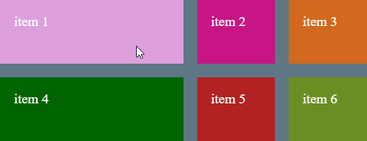
...
 <div class="container">
      <div class="item item1">item 1</div>
      <div class="item item2">item 2</div>
      <div class="item item3">item 3</div>
      <div class="item item4">item 4</div>
      <div class="item item5">item 5</div>
      <div class="item item6">item 6</div>
    </div>
...
We can also use percentages or a combination of percentages and fractional units. For example allow column 1 to take up 50% of the container width and column 2 and 3 using fractional units.
If we change the
grid-template-columnvalue to the following:... grid-template-columns: 50% repeat(2, 1fr); ...The result is:
© Lightnetics 2024