How do I make css grid items take up the entire container width?
-
If you revisit the article: How do I add gaps to my css grid layout?
The gaps between the items are all evened out however, items themselves are not sized to take up the entire width of the container.

The demo code is as follows:
CSS.
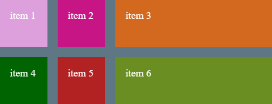
...
.container {
        width: 800px;
        background-color: rgb(95, 118, 133);
        margin: 40px auto;
        display: grid;
        grid-template-rows: 140px 140px;
        grid-template-columns: 140px 140px 140px;
      }

      .item {
        padding: 30px;
        font-size: 30px;
        color: #ffffff;
      }

      .item1 {
        background-color: plum;
      }

      .item2 {
        background-color: mediumvioletred;
      }

      .item3 {
        background-color: chocolate;
      }

      .item4 {
        background-color: darkgreen;
      }

      .item5 {
        background-color: firebrick;
      }

      .item6 {
        background-color: olivedrab;
      }
...
HTML.
...
 <div class="container">
      <div class="item item1">item 1</div>
      <div class="item item2">item 2</div>
      <div class="item item3">item 3</div>
      <div class="item item4">item 4</div>
      <div class="item item5">item 5</div>
      <div class="item item6">item 6</div>
    </div>
...
We can adjust each column by using the CSS value
autofor grid-template-columns to give us the following result... grid-template-columns: 140px 140px auto; ...You can see the third column auto adjust to fit the size of the container.
We can use CSS value auto for all three columns to give us the following:
...
grid-template-columns: auto auto auto;
...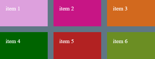
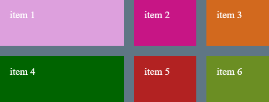
An alternative way of achieving the same thing is to use something called Fractional Units, a CSS Grid measurement unit.
We can have one column wider than another or all the same size.
...
grid-template-columns:  1fr 1fr 1fr;
...
or the short form using the
repeat function:... grid-template-columns: repeat(3, 1fr); ...Gives us:
...
grid-template-columns:  2fr 1fr 1fr;
...
Gives us:
In these examples we have used CSS property
grid-template-columnsbut the same can be applied withgrid-template-rows
© Lightnetics 2024