How do I add gaps to my css grid layout?
-
Also see: How do I create a css grid layout?
The demo is as follows:
CSS.
...
.container {
        width: 800px;
        background-color: rgb(95, 118, 133);
        margin: 40px auto;
        display: grid;
        grid-template-rows: 140px 140px;
        grid-template-columns: 140px 140px 140px;
      }

      .item {
        padding: 30px;
        font-size: 30px;
        color: #ffffff;
      }

      .item1 {
        background-color: plum;
      }

      .item2 {
        background-color: mediumvioletred;
      }

      .item3 {
        background-color: chocolate;
      }

      .item4 {
        background-color: darkgreen;
      }

      .item5 {
        background-color: firebrick;
      }

      .item6 {
        background-color: olivedrab;
      }
...
HTML.
...
 <div class="container">
      <div class="item item1">item 1</div>
      <div class="item item2">item 2</div>
      <div class="item item3">item 3</div>
      <div class="item item4">item 4</div>
      <div class="item item5">item 5</div>
      <div class="item item6">item 6</div>
    </div>
...
The result is:
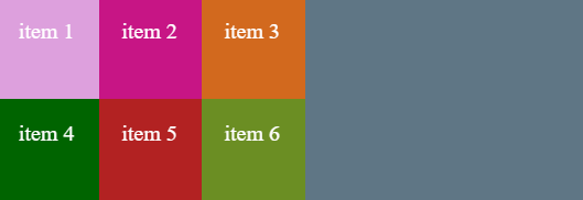
The items in the container can have gaps to change the appearance.
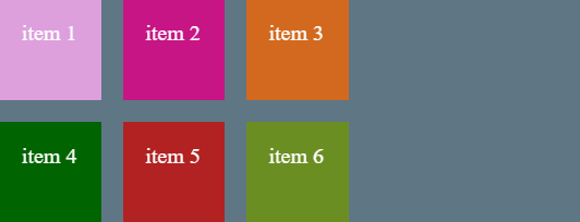
If we add the following CSS grid properties.
...
grid-row-gap: 40px;
grid-column-gap: 40px;
...
We can see the difference.
If the row and column gaps are identical, you can replace the two CSS lines with just
...
grid-gap: 40px;
...
© Lightnetics 2024