How do I justify content in a column when using flexbox?
-
In article: How do I use css flexbox to justify content in a container?
we showed the CSS
justify-contentproperty withflex-direction: rowIf we change the flex-direction to column the content does not appear as we expect.The demo code is below.
HTML.
...
 <div class="container">
      <div class="item item-1">1</div>
      <div class="item item-2">2</div>
      <div class="item item-3">3</div>
      <div class="item item-4">4</div>
      <div class="item item-5">5</div>
</div>
...
CSS.
...
 .container {
        margin-top: 50px;
        padding: 20px 0;
        background-color: brown;
        display: flex;
        flex-direction: column;
        flex-wrap: nowrap;
        justify-content: space-around;
      }

      .item {
        padding: 30px;
        background-color: burlywood;
        text-align: center;
        font-size: 30px;
      }
...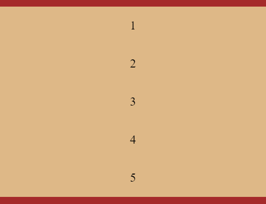
The content adjusts to the size of the container when we changed it to column.
To resolve this add a height to the CSS container and width to the CSS item. The edited CSS below:
...
     .container {
        height: 700px;
        margin-top: 50px;
        padding: 20px 0;
        background-color: brown;
        display: flex;
        flex-direction: column;
        flex-wrap: nowrap;
        justify-content: space-around;
      }

      .item {
        width: 50px;
        padding: 30px;
        /* margin: 10px; */
        background-color: burlywood;
        text-align: center;
        font-size: 30px;
      }
...
We now have
flex-direction: columndisplaying correctly, but if we change the flex-direction back to row. The result is not what we would expect.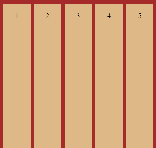
This is because the default value for the CSS property
align-itemsis stretch. If we change that toalign-items: flex-start;the result is: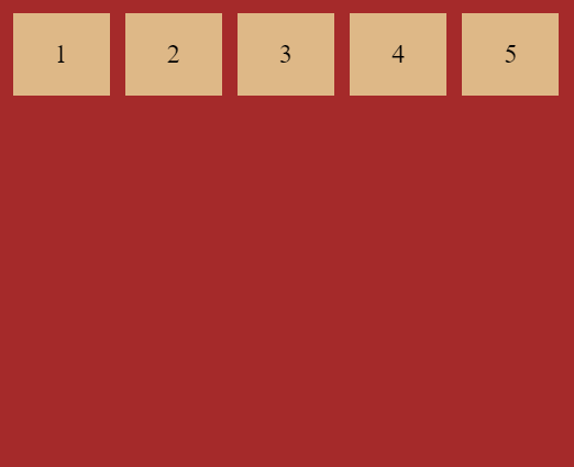
The CSS align-items has other values center, flex-end, and baseline.
© Lightnetics 2024