How do I use css flexbox to justify content in a container?
-
CSS flexbox, Flexible Box. Is a way of arranging elements within a container in a responsive way. A responsive design adapts to various device screen sizes.
Starting with the following demo HTML/CSS code.
HTML. Create a container assign it two classes, one generic and the second unique to the element.
...
 <div class="container">
      <div class="item item-1">1</div>
      <div class="item item-2">2</div>
      <div class="item item-3">3</div>
      <div class="item item-4">4</div>
      <div class="item item-5">5</div>
</div>
...
CSS.
...
 .container {
        margin-top: 50px;
        padding: 20px 0;
        background-color: brown;
        display: flex;
        flex-direction: row;
        flex-wrap: nowrap;
}

      .item {
        padding: 30px;
        background-color: burlywood;
        text-align: center;
        font-size: 30px;
}
...
The result is:

If we add various values to the CSS property
justify-contentit will position the contents of the container accordingly.Note:
justify-contentpositions items along the main axis. If theflex-directionis changed the result will be different, because the container by default takes up as much as needed to display its content.Adding
justify-content: flex-end;to our CSS you see the following result.
Change the value to
justify-content: center;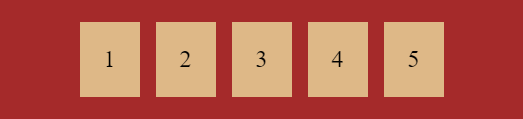
Change the value to
justify-content: space-between;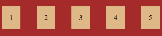
Change the value to
justify-content: space-around;
Change the value to
justify-content: space-evenly;
© Lightnetics 2024