How do I use css flexbox to be responsive to screen size?
-
CSS flexbox, Flexible Box. Is a way of arranging elements within a container in a responsive way. A responsive design adapts to various device screen sizes.
Starting with the following demo HTML/CSS code.
HTML. Create a container assign it two classes, one generic and the second unique to the element.
...
 <div class="container">
      <div class="item item-1">1</div>
      <div class="item item-2">2</div>
      <div class="item item-3">3</div>
      <div class="item item-4">4</div>
      <div class="item item-5">5</div>
</div>
...
CSS.
...
 .container {
        margin-top: 50px;
        padding: 20px 0;
        background-color: brown;
        display: flex;
      }

      .item {
        padding: 30px;
        margin: 10px;
        background-color: burlywood;
        text-align: center;
        font-size: 30px;
      }
...
The result is:

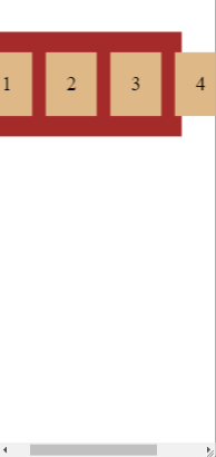
If the screen is changed to a smaller format we would see the result as below: A scrollbar is add and the container is not resized to the fit the items.
If we use
flex-wrap: wrapin our CSS the result looks better.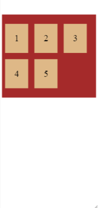
© Lightnetics 2024