How do I use css viewport width (vw) & viewport height (vh)?
-
Also see: How do I use length measurement units in css?
To show the viewport width (vw) and viewport height (vh) use. The code is shown first.
HTML used is:
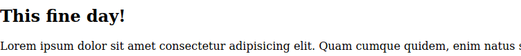
 <section>
        <h1>This fine day!</h1>
        <div>
            <p>Lorem ipsum dolor sit amet consectetur adipisicing elit. Quam cumque quidem, enim natus sed eligendi nesciunt obcaecati veritatis nemo facilis!
            </p>
        </div>
    </section>
This is result without CSS viewport properties.
Adding viewport width and viewport height to the CSS.
 section {
            font-size: 30px;
            background-color: orangered;
            color: #fff;
            height: 100vh;
            width: 50vw;
        }

        h1 {
            font-size: 100%;
            margin: 0;
        }

        section div {
            background-color: green;
        }
The result in the browser display on a desktop.
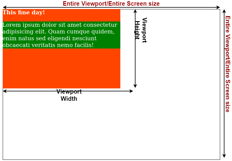
The full height of the viewport is take by
height: 100vhandwidth: 50vwis 50% of the viewport width.Viewpoint is based off the size of the screen/device.
© Lightnetics 2024