How do I use length measurement units in css?
-
In CSS there are two types of length units absolute and relative.
The length specified as an absolute unit in pixels (px) appear at the exact size given. They are not recommended because screen sizes change. Absolute also include cm - centimeters, mm - millimeters , in - inches, pt - points, and pc - picas
The relative length is relative to another length property. Relative units are:
em - relative the the font-size
ex - relative to the x-height
ch - relative to the width of zero
rem - relative to font-size of the root element
vw - 1% of the width of the viewport
vh - 1% of the height of the viewport
% - relative to the parent element.As you get familiar with units you will notice some are more common than others.
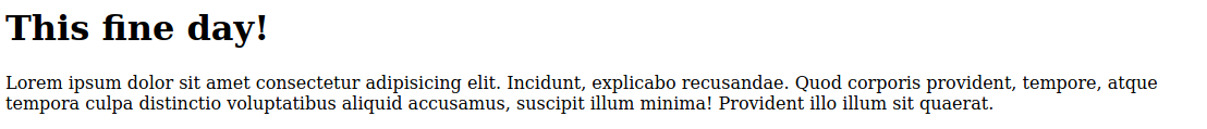
Here's the default view no size changes. Default sizes 32px for the heading and 16px for the paragraph.
Adding CSS code to change the font-size of both heading and paragraph. Absolute size of 20px
...
h1, p {
            font-size: 20px
        }
...
The result is:
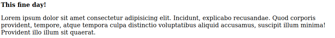
This is a fixed size, changing font-size elsewhere will not change the size of this content.
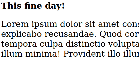
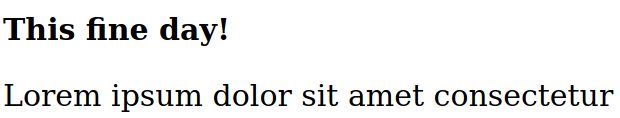
Changing the value of the font-size to font-size: 2em. 2 x the current font-size, so that is 2 x 16 = 32px
...
h1, p {
            font-size: 2em
        }
...
The result is:
If we add a font-size to the parent element.
...
        body {
            font-size: 20px
        }

        h1, p {
            font-size: 2em
        }
...
The result is:
The current font-size of the current parent element is 30px, so 2em for h1, p becomes font-size 60px
We can add font-size to the div parent element of h1, p to verify unit
emuses the closest parent element font-size.... body { font-size: 20px } h1, p { font-size: 2em } div { font-size: 10px } ...The result is: The heading font-size becomes 40px and the paragraph becomes 20px
If font-size is not assigned by any of the parent elements CSS uses the root element font-size, the root element is
<html>... html { font-size: 15px; } h1, p { font-size: 2em } ...The result is: 30px font-size.
Using the rem unit
The rem unit is only based off the root element
<html>Changing the parent div element font-size for h1, p will not have any effect when using rem... html { font-size: 15px; } h1, p { font-size: 2rem } div { font-size: 50px } ...
© Lightnetics 2024