How do I combine css media queries?
-
Note: If your media queries apply to all media types, " screen and" can be left out.
CSS media queries can be combined as shown in this CSS import rule.
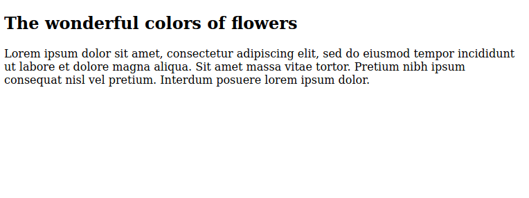
<!doctype html>

<html lang="en">
<head>
  <meta charset="utf-8">
  <title>Starter HTML Page</title>
  <meta name="description" content="HTML starter page">
  <meta name="author" content="Demo">
  <meta name="viewport" content="width=device-width, initial-scale=1.0">
  <style>
    @import url("375px.css") screen and (color) and (max-width: 375px);
  </style>
</head>

<body>

<h2>The wonderful colors of flowers</h2>
<p>Lorem ipsum dolor sit amet, consectetur adipiscing elit, sed do eiusmod tempor incididunt ut labore et dolore magna aliqua. Sit amet massa vitae tortor. Pretium nibh ipsum consequat nisl vel pretium. Interdum posuere lorem ipsum dolor.</p>

</body>
</html>
The 375px.css file.
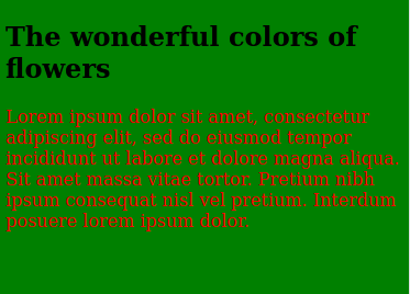
body {
  background-color: green;
}

p {
  color: red;
}
At desktop screen size it will look like this.
A phone device will look like this.
© Lightnetics 2024