How do I use a css media query in a link tag?
-
Note: If your media queries apply to all media types, " screen and" can be left out.
Also see: How do I use css media queries?
This example show the use of a media query in a <link> tag.
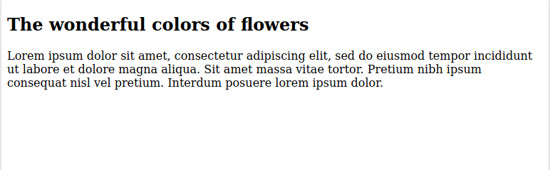
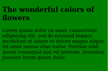
<!doctype html>

<html lang="en">
<head>
  <meta charset="utf-8">
  <title>Starter HTML Page</title>
  <meta name="description" content="HTML starter page">
  <meta name="author" content="Demo">
  <meta name="viewport" content="width=device-width, initial-scale=1.0">
  <link rel="stylesheet" media="screen and (max-width: 375px)" href="375px.css" />
</head>

<body>

<h2>The wonderful colors of flowers</h2>
<p>Lorem ipsum dolor sit amet, consectetur adipiscing elit, sed do eiusmod tempor incididunt ut labore et dolore magna aliqua. Sit amet massa vitae tortor. Pretium nibh ipsum consequat nisl vel pretium. Interdum posuere lorem ipsum dolor.</p>

</body>
</html>
375px.css file
body {
  background-color: green;
}
For a tablet device, this is the display:
For a phone device, this is the display.
© Lightnetics 2024