How do I use viewport?
-
The viewpoint is used via the <meta> tag, it provides control over displaying the web page correctly in relation to the size of the device being used.
The <meta> tags go inside the head section of the html document.
The viewpoint here is set with the content and initial-scale attributes.
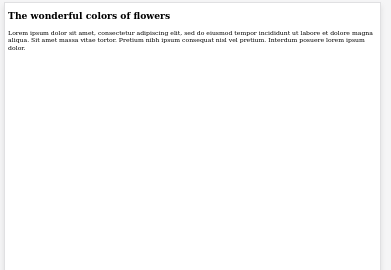
<!doctype html>

<html lang="en">
<head>
  <meta charset="utf-8">
  <title>Starter HTML Page</title>
  <meta name="description" content="HTML starter page">
  <meta name="author" content="Demo">
  <link rel="stylesheet" href="">
</head>

<body>

<h2>The wonderful colors of flowers</h2>
<p>Lorem ipsum dolor sit amet, consectetur adipiscing elit, sed do eiusmod tempor incididunt ut labore et dolore magna aliqua. Sit amet massa vitae tortor. Pretium nibh ipsum consequat nisl vel pretium. Interdum posuere lorem ipsum dolor.</p>

</body>
</html>
The code above does not have the viewport meta tag. This is how the page looks on a mobile device. The header and paragraph look are not easy to read and the page did not scale properly.
Add viewport
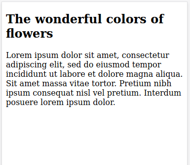
<meta name="viewport" content="width=device-width, initial-scale=1.0">Reload the page, now its easier to read and has scaled to the browser on the mobile device..
© Lightnetics 2024