How do I use css grid to automatically fit as many columns as possible?
-
To automatically fit the maximum number of columns based on the width size of the grid can be done using the
auto-fillvalue to the CSSgrid-templatel-columnproperty.The demo code is:
HTML
...
 <div class="container">
      <div class="item item1">item 1</div>
      <div class="item item2">item 2</div>
      <div class="item item3">item 3</div>
      <div class="item item4">item 4</div>
      <div class="item item5">item 5</div>
      <div class="item item6">item 6</div>
      <div class="item item5">item 7</div>
      <div class="item item6">item 8</div>
    </div>
...
CSS
...
 .container {
        width: 800px;
        background-color: rgb(95, 118, 133);
        margin: 40px auto;
        display: grid;
        grid-template-columns: repeat(auto-fill, 800px);
      }

      .item {
        padding: 10px;
        font-size: 30px;
        color: #ffffff;
      }

      .item1 {
        background-color: plum;
      }

      .item2 {
        background-color: mediumvioletred;
      }

      .item3 {
        background-color: chocolate;
      }

      .item4 {
        background-color: darkgreen;
      }

      .item5 {
        background-color: firebrick;
      }

      .item6 {
        background-color: olivedrab;
      }

      .item7 {
        background-color: navy;
      }

      .item8 {
        background-color: yellow;
      }
...
See line 7 of the CSS container.
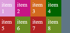
The result is:

Two extra columns were create because the width size is 800px, this was to fill up the remaining container size. If we made the
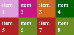
auto-fitthe two extra columns would not be created and would be based on the number html items.The
auto-fitwraps items as the browser window shrinks.Browser windows view before making browser window size smaller.

After making the browser window size smaller.
If we use a combination of
auto-fitandminmaxas seen below.grid-template-columns: repeat(auto-fit, minmax(80px, 1fr));We can see the extra space of the container is also used and look a lot cleaner.

and also when the browser window size is made smaller.
© Lightnetics 2024